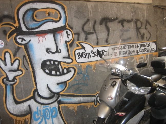
I unfortunately missed the performance art day, so I can't really talk about what all that was like. I can say that after watching various performance art videos that I can't say I'm impressed. I know that they're supposed to convey a very direct feeling or idea, and at the same time cause a reaction, but I just can't take them seriously. Performance art should be dance, theatre, not people playing with food and scaring people on the street. That reminds me more of Jackass.
I did find one artist (thanks to Rachel Fick's blog Love Letters From Laser) who does a series of very strange performance art videos that he posts on youtube. His name is Ryan Trecartin, and according to Rachel, his kind of work is all the rage in New York City right now. Here are some examples of his work:
And here's the link to his youtube account: http://youtube.com/user/WianTreetin
Upon first viewing his video, I couldn't help but be intrigued. It has an interesting, materialistic view on our generation, and I enjoyed it's fast, colorful showing. It's very entertaining!
Here's my performance art video. Thanks to Jason Bowers for his participation.
The point of performance art is to interact with the audience, and to cause a reaction. Our piece was fun and engaging, if not kind of awkward. I like how the film is in black and white and makes it try and be a old horror film, even though it's obviously not serious. People on the street usually reacted in a positive manner, if not a little surprised.
Tuesday, November 13, 2007
Friday, October 12, 2007
Enjoi Skateboards Logo

Enjoi is a skateboard company with a panda bear logo. Their logo is a panda, which could stand for a lot of things, but because of the way they use negative space to their advantage (the way the panda's white fur usually blurs with its background) and use the same panda side view pose, it is easily recognizable. It is also only black and white, which makes it easier to reprint or replicate with color. It's not too complicated- so it can be resized and printed on a variety of objects, such as t-shirts, skateboards, etc. I'd say this is a very strong logo for a skateboard company.
Newseum: Too New
A few years ago I went to the National Archives building here in Washington, DC. Before entering the vault o see the Deceleration of Independence and all those important documents we had to watch a short play involving two way mirrors to give the idea ghosts were around telling stories about our nations history. While it a relatively interesting story, I couldn't tell you want it was about today. But, I do remember that I was ready to move on as soon as they ushered us into the small theater.
Unless I plan on going to an Imax, watching a video/play in a museum is the last thing I want to do. I like to browse in museums, go at my own pace and kind of mull things over in my own world. Big dramatic set-ups tend to throw me off, and they usually tend to be even a little tacky.
That's why I really appreciated Blake Gopnik's article "Art Museum Expansion: A Conservative Trend?" There is nothing more annoying then clogs of people surrounding pieces. These days it is impossible to the Mona Lisa- she's surrounded by loud, disruptive tourists all clamoring to get a snapshot of her. Viewing art shouldn't be a race- it's supposed to be in a tranquil setting, with lot's of room to stand back and view.
In some ways I understand the museums' expansions, but more so for the amazing architecture's sake. Modern architecture is only getting more out there, but it tends to take away from the art (Which was sometimes the argument on buildings such as Frank Gehry's Guggenheim Museum in Spain).
When it comes to museums, I most relate to those who hang on to their eight track tapes, their records and their type writers. While the Newseum's website will be interesting and helpful when doing research (not unlike understandingduchamp.com) it's just not the same as viewing the real thing in person.
I mean, I've seen countless photos of the Mona Lisa, but can I really say that I've seen the Mona Lisa in her entirety?
Not until I get to Paris.
Unless I plan on going to an Imax, watching a video/play in a museum is the last thing I want to do. I like to browse in museums, go at my own pace and kind of mull things over in my own world. Big dramatic set-ups tend to throw me off, and they usually tend to be even a little tacky.
That's why I really appreciated Blake Gopnik's article "Art Museum Expansion: A Conservative Trend?" There is nothing more annoying then clogs of people surrounding pieces. These days it is impossible to the Mona Lisa- she's surrounded by loud, disruptive tourists all clamoring to get a snapshot of her. Viewing art shouldn't be a race- it's supposed to be in a tranquil setting, with lot's of room to stand back and view.
In some ways I understand the museums' expansions, but more so for the amazing architecture's sake. Modern architecture is only getting more out there, but it tends to take away from the art (Which was sometimes the argument on buildings such as Frank Gehry's Guggenheim Museum in Spain).

When it comes to museums, I most relate to those who hang on to their eight track tapes, their records and their type writers. While the Newseum's website will be interesting and helpful when doing research (not unlike understandingduchamp.com) it's just not the same as viewing the real thing in person.
I mean, I've seen countless photos of the Mona Lisa, but can I really say that I've seen the Mona Lisa in her entirety?
Not until I get to Paris.
Thursday, October 11, 2007
The Large Glass: Marcel Duchamp
Marcel Duchamp is an interesting character in general. I’ve always appreciated his “found art” such as “Fountain,” and his painting “Nude Descending a Staircase.” In the case of “The Large Glass,” I am not so impressed.
I do agree with parts of it, depending on how well I’m reading it. Whether he’s talking about marriage, intercourse, or love, it can become a routine in an assembly line, with different kinds of machinery and reactions, but it appears to be so bitter and lacks a lot of hope when it comes to relationships. The Glass is clever and thought provoking, but it’s also very crude.
To me “The Large Glass” was made to tease the viewer to make their own decisions of what it means, at the same time giving a strong insinuation to a certain kind of idea, judging by its full title “The Bride Stripped Bare By Her Bachelors, Even.” Which is probably true. As Tomkins says, Duchamp didn’t want the Glass to be his autobiography, or his self-expression. Well, what was the point then?
And when he left it unfinished, did he leave anything key to the understanding out?
Part of what turns me away from it is shallow and superficial. I don’t like the mechanical depictions; I don’t find them interesting to look at and without the explanations of their meaning it’s hardly worth bothering with. After reading Calvin Tomkins “Duchamp: A Biography” and Andrew Stafford’s understandingduchamp.com I still feel confused about the inner workings of the piece and why he bothered making it, and what he wanted to convey to the viewer.
Tomkins said that if you approach Duchamp’s work with a light heart the rewards are everywhere in sight, but I can’t laugh at The Large Glass. I don’t find it funny. The sexual undertones seem dark and demeaning some how, and the mechanical setting is just another Science class to me. (And I didn’t do very well in any Science classes.)
If I hadn’t read Tomkins paper I probably would have assumed he was hostile toward women and marriage, and that he had a lot of problems within his love life.
It’s also frustrating that he needed the Green Box to explain “The Large Glass.” While Calvin Tomkins, in “Duchamp: A Biography”, as well as understandingduchamp.com, states that the Green Box and its notes (created by Duchamp himself) is essential for its understanding, I feel that it defeats the purpose of its making. Not that I would have the notes be destroyed or unread, but he left the notes specifically for viewers, not just for his own personal records, and in this kind of art it just doesn’t seem to fit since he was trying to make to make the Large Glass’s viewer think about what it meant.
In Tomkins’ paper he says that to some “’dedicated Duchampians’, the message of the Large Glass is anything but hilarious.” I tend to agree with them. I don’t think it’s that funny, to me it sounds pessimistic and very bitter. The explanations on the two sources add on to it to me, especially in Tomkins’ essay. While I don’t think Duchamp’s work is “destructive,” and it does make the viewer question what he was thinking, surely, and as I said, I do appreciate his work, experiments, and jokes. Other then the Large Glass, which I cannot bring myself to like.
(Image from http://www.tate.org.uk)
I do agree with parts of it, depending on how well I’m reading it. Whether he’s talking about marriage, intercourse, or love, it can become a routine in an assembly line, with different kinds of machinery and reactions, but it appears to be so bitter and lacks a lot of hope when it comes to relationships. The Glass is clever and thought provoking, but it’s also very crude.
To me “The Large Glass” was made to tease the viewer to make their own decisions of what it means, at the same time giving a strong insinuation to a certain kind of idea, judging by its full title “The Bride Stripped Bare By Her Bachelors, Even.” Which is probably true. As Tomkins says, Duchamp didn’t want the Glass to be his autobiography, or his self-expression. Well, what was the point then?

And when he left it unfinished, did he leave anything key to the understanding out?
Part of what turns me away from it is shallow and superficial. I don’t like the mechanical depictions; I don’t find them interesting to look at and without the explanations of their meaning it’s hardly worth bothering with. After reading Calvin Tomkins “Duchamp: A Biography” and Andrew Stafford’s understandingduchamp.com I still feel confused about the inner workings of the piece and why he bothered making it, and what he wanted to convey to the viewer.
Tomkins said that if you approach Duchamp’s work with a light heart the rewards are everywhere in sight, but I can’t laugh at The Large Glass. I don’t find it funny. The sexual undertones seem dark and demeaning some how, and the mechanical setting is just another Science class to me. (And I didn’t do very well in any Science classes.)
If I hadn’t read Tomkins paper I probably would have assumed he was hostile toward women and marriage, and that he had a lot of problems within his love life.
It’s also frustrating that he needed the Green Box to explain “The Large Glass.” While Calvin Tomkins, in “Duchamp: A Biography”, as well as understandingduchamp.com, states that the Green Box and its notes (created by Duchamp himself) is essential for its understanding, I feel that it defeats the purpose of its making. Not that I would have the notes be destroyed or unread, but he left the notes specifically for viewers, not just for his own personal records, and in this kind of art it just doesn’t seem to fit since he was trying to make to make the Large Glass’s viewer think about what it meant.
In Tomkins’ paper he says that to some “’dedicated Duchampians’, the message of the Large Glass is anything but hilarious.” I tend to agree with them. I don’t think it’s that funny, to me it sounds pessimistic and very bitter. The explanations on the two sources add on to it to me, especially in Tomkins’ essay. While I don’t think Duchamp’s work is “destructive,” and it does make the viewer question what he was thinking, surely, and as I said, I do appreciate his work, experiments, and jokes. Other then the Large Glass, which I cannot bring myself to like.
(Image from http://www.tate.org.uk)
Friday, September 28, 2007


A lot of the designs are pretty symmetrical. All of them seem pretty ornate, especially if they're mosaics to decorate buildings. I really like paisley designs especially, I love how complicated and delicate they are. The lace is an interesting way to look at patterns with different textures and transparencies.
Thursday, September 27, 2007
Gestalt


I've always enjoyed images like these just because not everyone does see both sides to what they could be. (i.e. the young and the old woman in the first example, the young woman and the man playing the saxophone in the second image.) It could actually be a good comment on what art is in general. Depending on the subject, art has different meanings to everyone- everyone can read into it in their own way.
http://web.educastur.princast.es/proyectos/jimena/pj_ciriacomh/asp1/investigacion/vermensajebb.asp?idmensaje=857
Friday, September 14, 2007
Economics

I've always said that I never wanted to work for Nike or any of those elite corporate sponsors with the sweat shops in some arm pit of a third world country. I think that's at least one value I'd like to stick to- try to stay away from sweatshop-backed places. Except now I might get this internship with American Girl Dolls this summer... those dolls are made overseas, don't know if the dolls and accessories are made in rightful conditions or not.
But who knows if a good enough opportunity came along? Wouldn't you be crazy not to take it? But isn't that what most people in those jobs could argue? That yeah, maybe they knew about what was going on behind the scenes negatively, but it was just too good of a chance to pass up. What if that opportunity gave you the chance to do things you really wanted to do- travel, choose your own projects, etc.
I'd like to think that I would retain enough ethics to turn it down.
I don't really know what I want to do as a job. I don't really want to just live on my art. I do want to make art and sell it, I just don't want that to be my only means of supporting myself. I want a "real job," too.
Friday, September 7, 2007
Yarn Exersize
As soon as we got over the initial "what the hell are we doing" feeling it was a lot of fun... I decided to avoid making knots and causing problems, and just made a man on the ground with my PINK (my favorite color!) continuing line... But it kept getting destroyed because people kept stepping on it. But I guess that's to be expected with installations. And the design kept changing. It was cool because I like to do drawings like that where I never pick my pen off the paper so the image is a bunch of knots all thrown together.
It's kind of like being in a big pink and white spiderweb. The knots are like bugs that have been caught and are ready for eatin'.
The whole thing kept growing and getting more and more intricate... If we would've kept going we probably wouldn't have been able to move around the room. I feel like people just let the string take them wherever and it turned out to be pretty random and all over the place.
If you look at just the positive space it's like if you were to connect the stars in constellations. It'd be kind of interesting to pick a piece of the web and have everyone say what the positive space looked like to them, such as a rectangle, or something more complicated liiike The Big Dipper or a spider web or Cat's Cradle or something.
Line>Shape

I think that they could all be lines or shapes. Lines are generally open marks that can range as anything from a mark showing the distance from point A to point B, or they could be deep squiggles all over the paper. They also tend to show a lot more movement then a shape, as shapes are solid and "stay in one place." A line easily becomes a shape simply by connecting one end of a line to the other.
I see Image A as more of a closed, geometric shape (like a wedge) rather then a open line. B could be part of a cursive V which would be more line-like then shape like. C looks like a rectangle, but could also be a linear dash, but appears to be too thick to be just a line. D is very organic, like a plant, but could be just a "squiggle-line," with a lot of movement and speed to it. I think part of what makes me think of shapes instead of lines with these is because they're filled in with black, making the postive space so much more noticeable. With a line, the negative, bright space stands out more.
Wednesday, September 5, 2007
First Critique

The painting depicts a young woman with blonde hair held back with a braided ribbon reclining on a white bed. She is nude, with her left hand slightly covering herself. She holds a small bouquet of flowers in her right hand, and a small dog is curled up at her feet on the bed. She looks candidly at the viewer, and two maids are in the background of the highly ornamented room. A window opens up to a pretty view, a possibly twilight sky. The woman's reclining body is spread out across the piece, balancing out the composition, which the women in the background help out with as well.
The woman is calm and very comfortable with herself. She pays no attention to the two women behind her, and boldly stares at the viewer. The tranquillity of this piece is underlined by the soft curve of her body on the bed, the evenness of her skin tone and lack of drastic shadows.
Judging by the fairness of her skin, her jewelry, the wall decorations around her, and the small dog signifies that the subject is probably very rich. There is a good chance she could be a courtesan to a royal courtier or someone else of high standing, especially if you are to look at the candidness of her stare.
There is a general softness to this piece, due to her reclining pose, the light outside the window, and lack of shadows on and around her body.
She is the artist's depiction of Venus. The blonde hair, the reclining figure, the way her skin almost seems to glow and the slight covering of herself. To me, the hand grasping the flowers is trying to understate the fact of her purity and youth.
I personally like this piece, the perspective and composition is well done. You can tell that the maids are in the background of the piece. The only thing that's kind of confusing is where the wall/tapestry ends behind the subject. The edge seems too dark and too blunt for where it ends, especially compared with the brightness of the subject's body.
She also seems to float on her pillows, which lack a certain heaviness of her body leaning on them.
I really like the curve of her body against the sheets, and the proportions are relatively well-done (if not a little elongated.)
As a Venus, I think the subject is a little too frank, and lacks a certain amount of innocence. Especially since she appears to be so comfortable with herself.
Subscribe to:
Comments (Atom)